동적으로 뷰포트가 변할 때 효율적으로 요소 배치, 정렬 가능한 레이아웃 방식
Flexbox의 구성
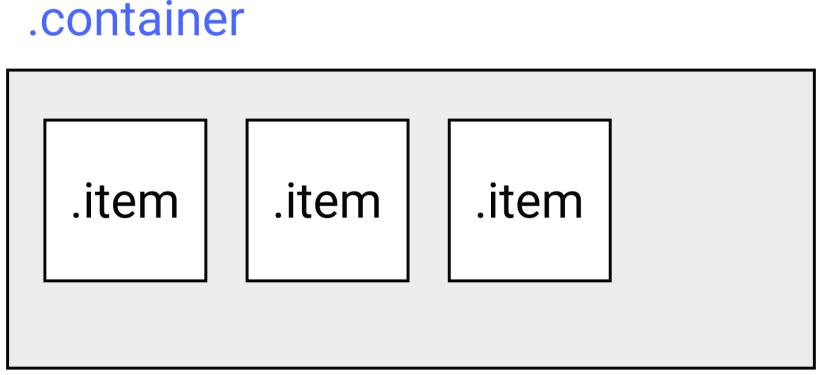
container(부모요소)와 item(자식요소)이 가지는 속성이 다름!
- container의 속성 : item을 어떻게 정렬할 것인지를 정함
- item의 속성 : 크기나 순서를 정함
Flex Container 속성
** Container의 속성을 부여하기 전에 display: flex; 라고 선언해야함
flex-flow
flex-flow: flex-direction flex-wrap;flex-flow: 주축은어디 여러줄묶음방식
ex- border: 1px solid #000;과 같이 단축속성 부여하는 것
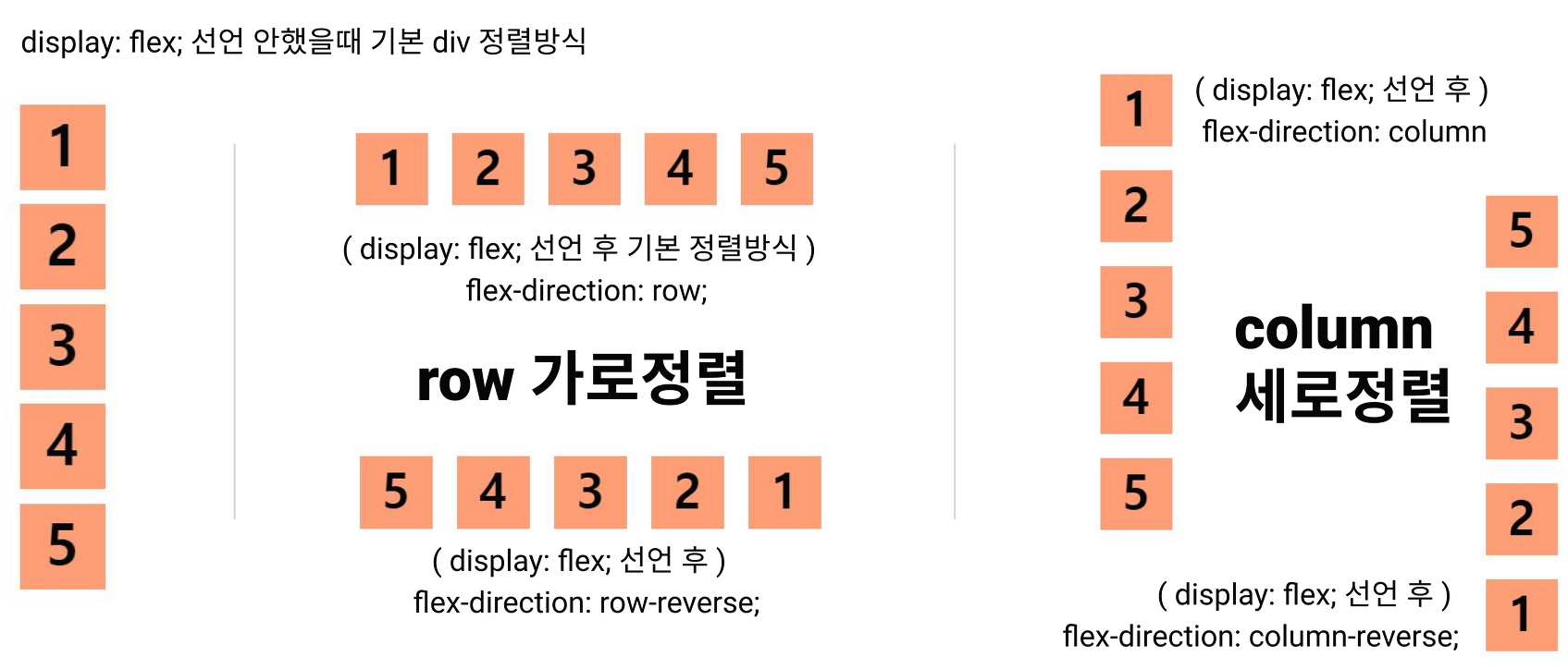
* flex-direction
요소 정렬방식 속성
.container {
 display: flex;
 flex-direction: row; //default값
 flex-direction: row-reverse;
 flex-direction: column;
 flex-direction: column-reverse;
}
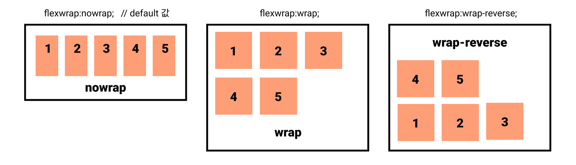
* flex-wrap
요소 줄바꿈 속성
| nowrap | 한 줄에 요소 배치할 경우 |
| wrap | 요소의 크기를 변형하지 않고 감싸고 있는 컨테이너 크기에 맞추어 배치할 경우 |
| wrap-reverse | wrap의 역방향으로 배치할 경우 |
.container {
 display: flex;
 //속성 종류
 flex-wrap: nowrap; //default값
 flex-wrap: wrap;
 flex-wrap: wrap-reverse;
}
.container {
  display: flex;
  flex-wrap: nowrap;
  /**
  flex-wrap: wrap;
  flex-wrap: wrap-reverse;
  **/

  width: 300px; //넓이만 지정
  border: 3px solid black;
}

.item {
  background-color: #FE9E76;
  width: 60px;
  height: 60px;
  margin: 10px;
}
2) justify-content : 행의 끝을 나란히 맞추다 -> 가로정렬
* flex-start, end
* center
* space-between : 감싸고 있는 container 양 옆에 여백을 주지 않음
* space-around : 감싸고 있는 container 양 옆에 동등한 여백을 줌
* stretch : 간격에 맞추어 요소들이 늘어며 container를 채움
3) align-items : 교차축을 중심으로 자식요소들을 정렬하는 방식 -> 수직정렬
!!주의 item들이 한 줄일 경우 align-items를 많이 사용!!
!! align-content와 헷갈리지 말 것 !!
*stretch : item 늘림 -> 기본값
*flex-start, end
*center
*base-line : items를 문자 기준선에 정렬
4) align-content : 여러줄 생성 되어있을 경우 어떻게 줄간격을 만들지
!! 여러줄일 경우 사용!!
*stretch
* flex-start, end
* center
* space-between : container을 채우고 사이 간격을 비워둠
* space-around : container 상하의 여백을 주고 간격을 비워둠
'CSS' 카테고리의 다른 글
| [CSS] 셀렉터 (Selectors) - 속성 (0) | 2022.04.05 |
|---|---|
| [ CSS ] Flexible 단위 (0) | 2021.09.16 |